Corporate Design of the Saxony Trade & Invest Corp.
With its newly developed word and design mark for 2021/2022, the Saxony Trade & Invest Corp. (Wirtschaftsförderung Sachsen GmbH - WFS) is emphasizing its corporate philosophy by literally standing behind its Saxony location (“S”).

As an instrument of Saxony's economic policy, the Saxony Trade & Invest Corp. (WFS - Wirtschaftsförderung Sachsen GmbH) contributes to the sustainable positive development of Saxony's economy. The establishment of innovative and competitive companies in Saxony and the strengthening of local companies through sales promotion and cooperation mediation are the main tasks of WFS in addition to location marketing for Saxony.
The brand image was created in collaboration with the Chemnitz advertising agency Haus E.
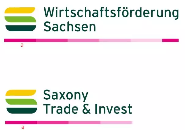
Brand Image
A stylized S as a figurative mark, derived from the first letter of the location Saxony as well as from the colors and shape of the sovereign Free State of Saxony coat of arms. The rounded corners of the three color bars emphasize the visual connection and clarify the S.
The "S" may not be used on its own as the WFS logo. The company name is an essential part of the brand.
- The width of the "S" (a) defines the overall length of the logo. The length of the Germanlogo (without the protective space) is 5.5 times the width of the "S".
- The width of the "S" (a) defines the total length of the logo. The length of the Englishlogo (without the protective space) is four times the width of the "S".
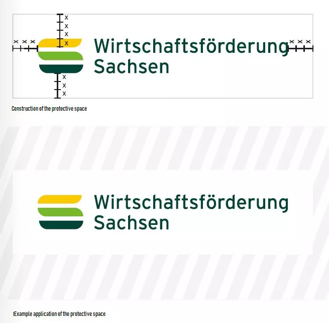
Protective Space
The protected space is the area around the word / image mark in which no other elements may be placed. The protected space guarantees the brand image a sovereign appearance and provides the viewer with orientation regarding the sender identification of the content to be communicated.
The protective space for the logo is always at least three times the height (x) of a color bar in the "S" on all sides.
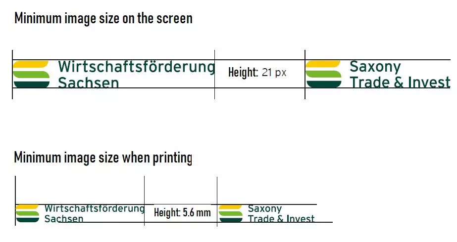
Minimum Image Sizes
The specifications regarding the image size are intended to ensure that the brand image is always recognizable and legible.
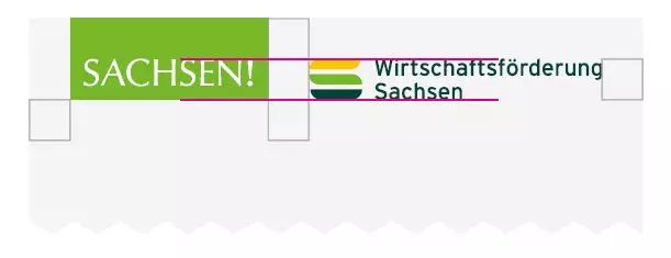
Application Together With the SACHSEN! or SAXONY! Brand
In the case of the joint appearance of the two brands SAXONY! and Saxony Trade & Invest Corp., the SAXONY! CD specifies the arrangement of the brands in relation to each other.
The protective space between the logos is AT LEAST half the height of the SACHSEN! or SAXONY! "box".
Both logos may also be positioned in a different order (Saxony Trade & Invest Corp. on the left, SAXONY! on the right) depending on the occasion.
Possible Applications
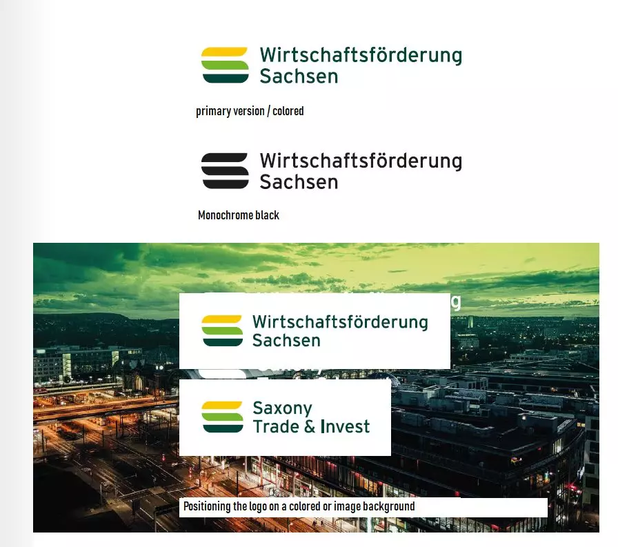
The logo should generally be displayed in color, as the colors stand for our identity and affiliation to Saxony. Only in exceptional cases may the logo be displayed in black. For this, coordination with WFS Marketing is required.
On colored backgrounds or image backgrounds, the logo must always be displayed with the white protective space and in color.
An inverse presentation - i.e. in monochrome white on a colored / image background - is expressly not permitted.
Colors
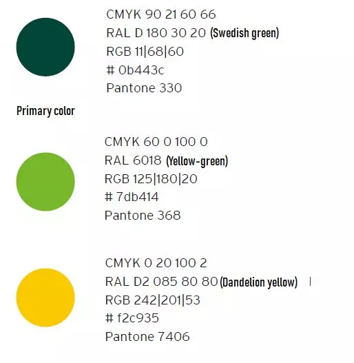
The colors of the logo are derived from the colors of the Federal State of Saxony's coat of arms.
The dark green is to be used as the primary color, i.e. in colorful designs it is always the dominant color in terms of quantity.
Colors other than the three defined here may only be used in connection with WFS publications if, for example, there is no other way to present statistical facts graphically (pie chart, etc.).
Typography
Text in print media
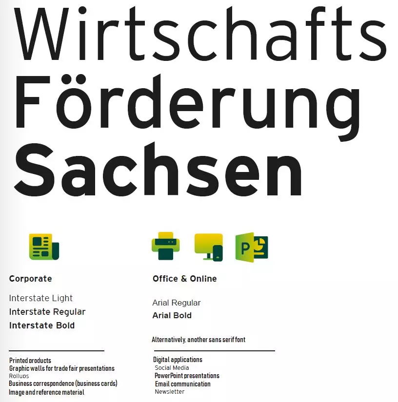
- The Interstate font in the Light, Regular and Bold weights is used for texts in all print media. FF DIN in the Light/Regular and Medium/Bold weights is recommended as a sans serif font alternative.
Correspondence
- The Arial font is used for business mail and formal customer communication. This specification applies to both digital (e.g. email) and analog media (e.g. letter post).
Internet
- Only non-serif fonts are used for the WFS website. The Open Sans font family is used for body text, while Helvetica (FF DIN Web) is used for headlines.
CD manual and logo files
The logo of the Saxony Trade & Invest Corp. is available for download in various versions and file types. If you have any questions and / or require other template files, please contact the contact persons listed below in our marketing area.
Your contact persons

Susan Pietzsch
Industry, Innovation & Marketing
+49-351-2138 250

Katrin Golde
Industry, Innovation & Marketing
+49-351-2138 252